Product Designer
Responsive Website
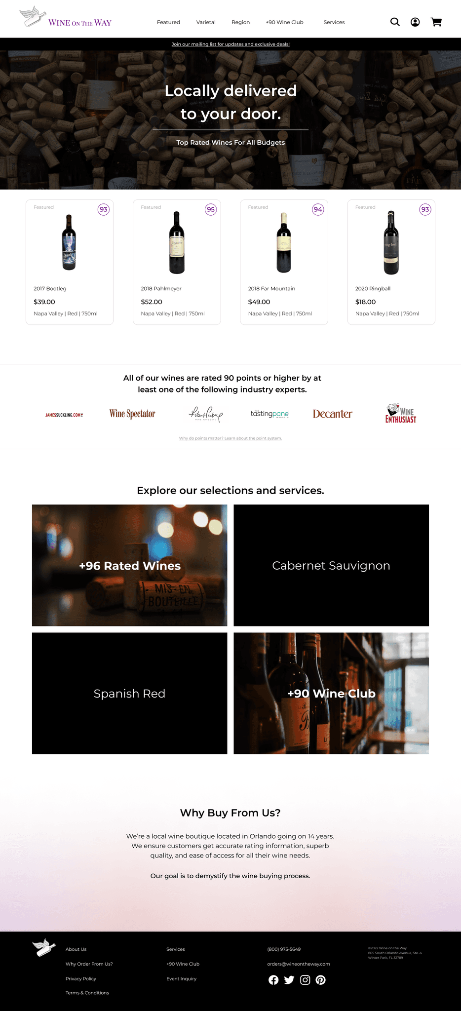
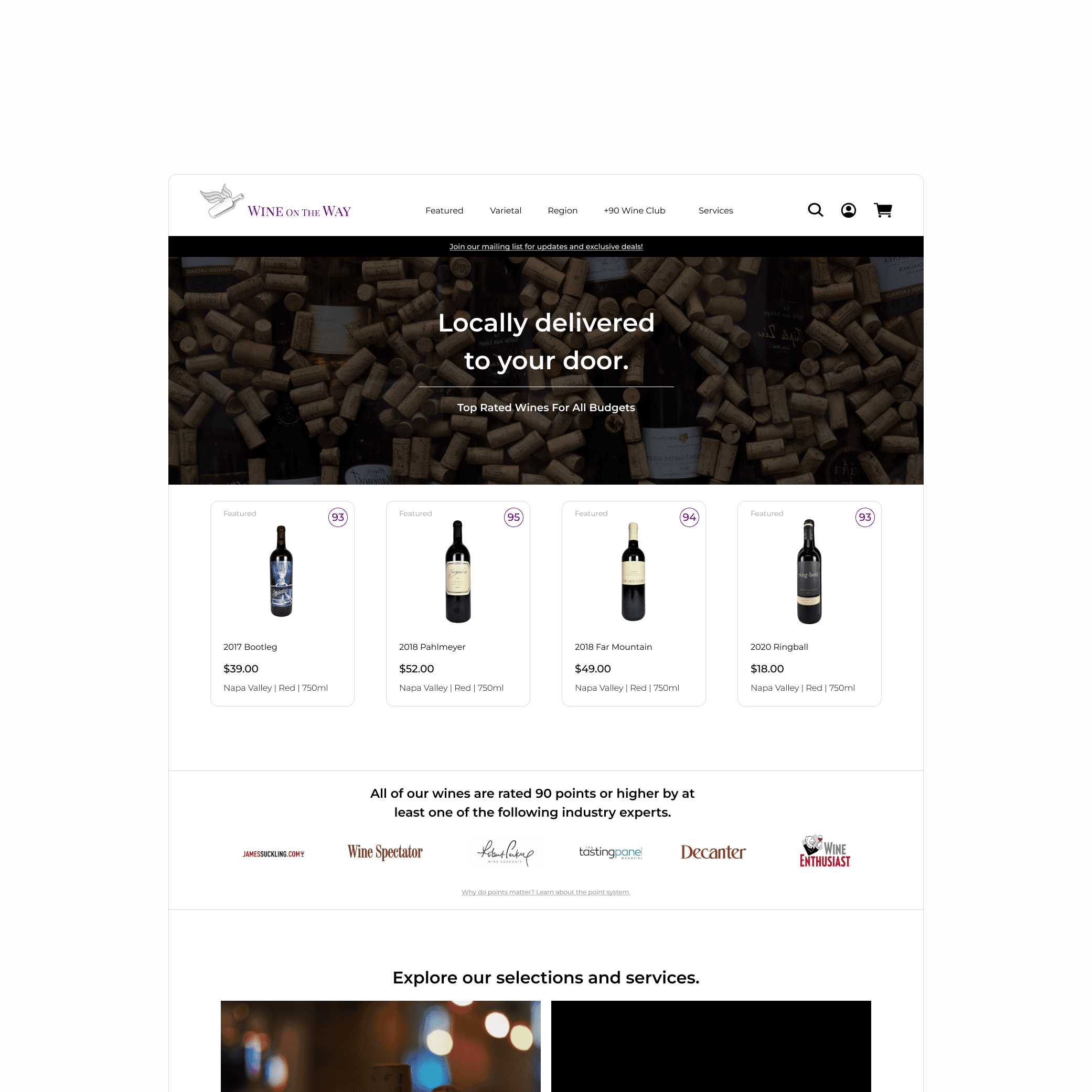
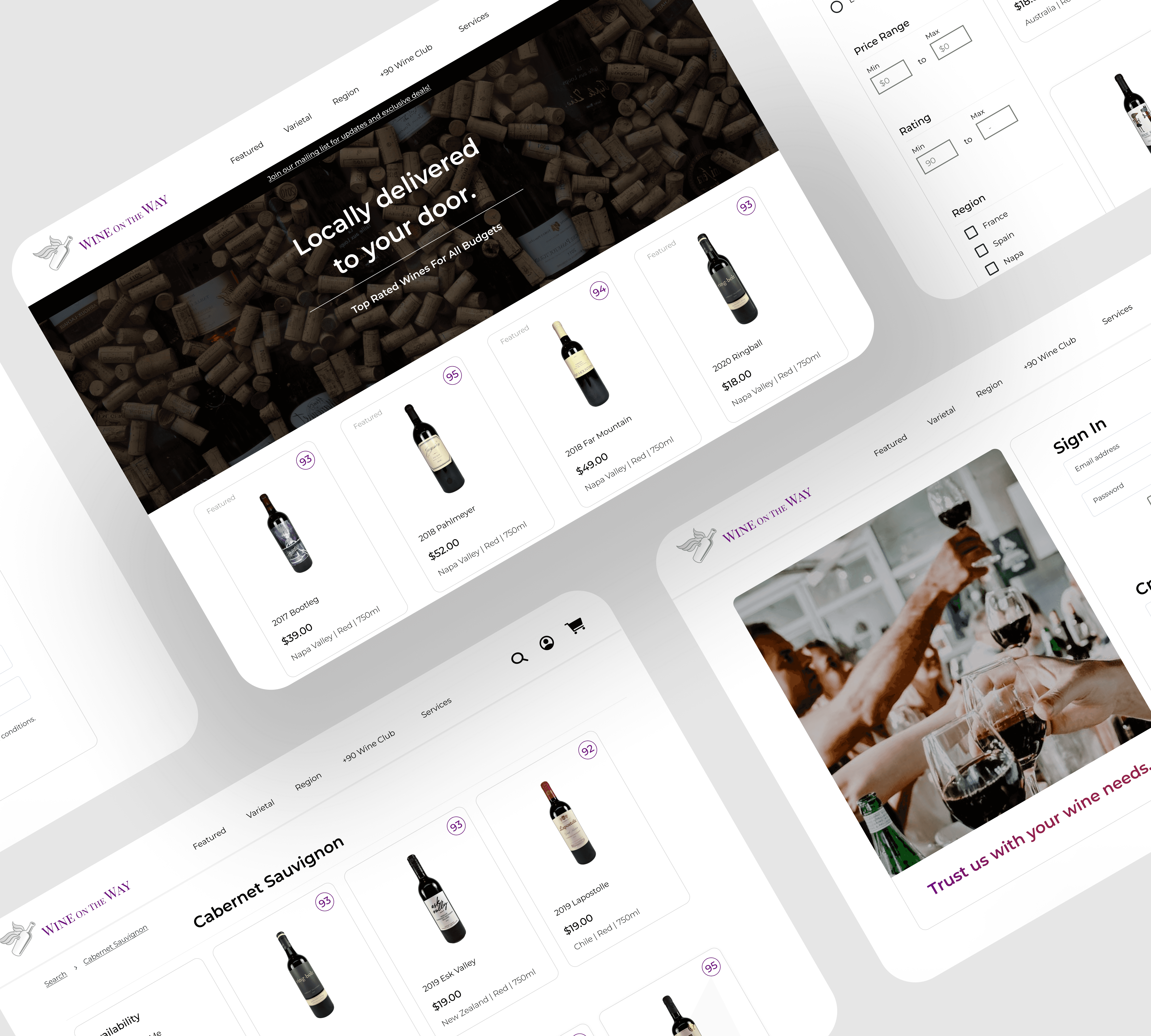
Redesigning a local Orlando wine boutique's website to help deliver an easier check out flow with an effortless customer experience. The first client I had the honor of working with into my design career. I offered to give their website a refresh/redesign for a few reasons which I’ll get into.
Long Checkouts
Checkouts are timely, sluggish, and not user friendly.
Confusing Layouts
From the landing page, to account creation, the screens are confusing and lack guidance.
Outdated for Growth
Because the site is old, a lot of the services, like shipping and data, are old and require lots of manual work.
The goal was to create a redefined experience that enables users to check out faster and navigate easily.
This design should be feasible on any website builder like Shopify, Squarespace, etc.
Let's see where this leads.
the data
Interviews, Competitive Analysis, Site Mapping
Interviews



Majority of existing customers would be more encouraged to buy online if the experience was more user-friendly.
Customers want to see featured wines, new selections, and check out quickly when they visit the website.
Rating, price, and region of the wine are among the most important to customers.
Employees believe that much of the tools and software used could be upgraded for better efficiency.
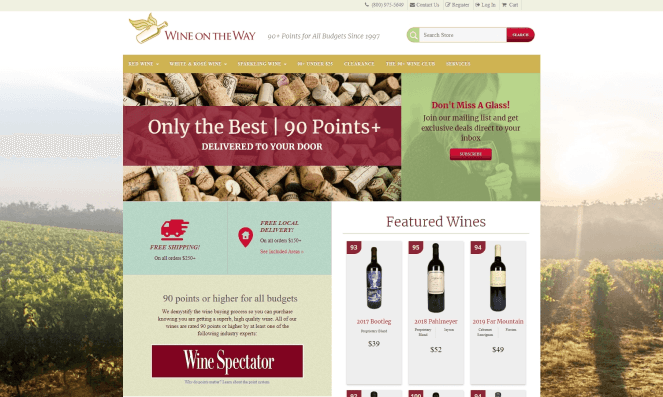
Understanding the how the flows can impact your customer are crucial here. Customers want featured wines on the landing page as it's a high click rate based on the research of customers and interviews with the owners and employees.
Even if customers scour the selections elsewhere, in the end the checkout should be compact, and easily understandable. From selecting a wine quickly on the home page, to flying through checkout, this should be seamless.

Cycling through bare minimum designs of the landing page led me down a path for a lot of different iterations. I was thinking that in a way, these pages all gave off different ideas or feelings rather than a wine boutique.
Toward the end of this low-mid fidelity stage, the layout of the landing page would work, but the end idea would be more concise and fluid.
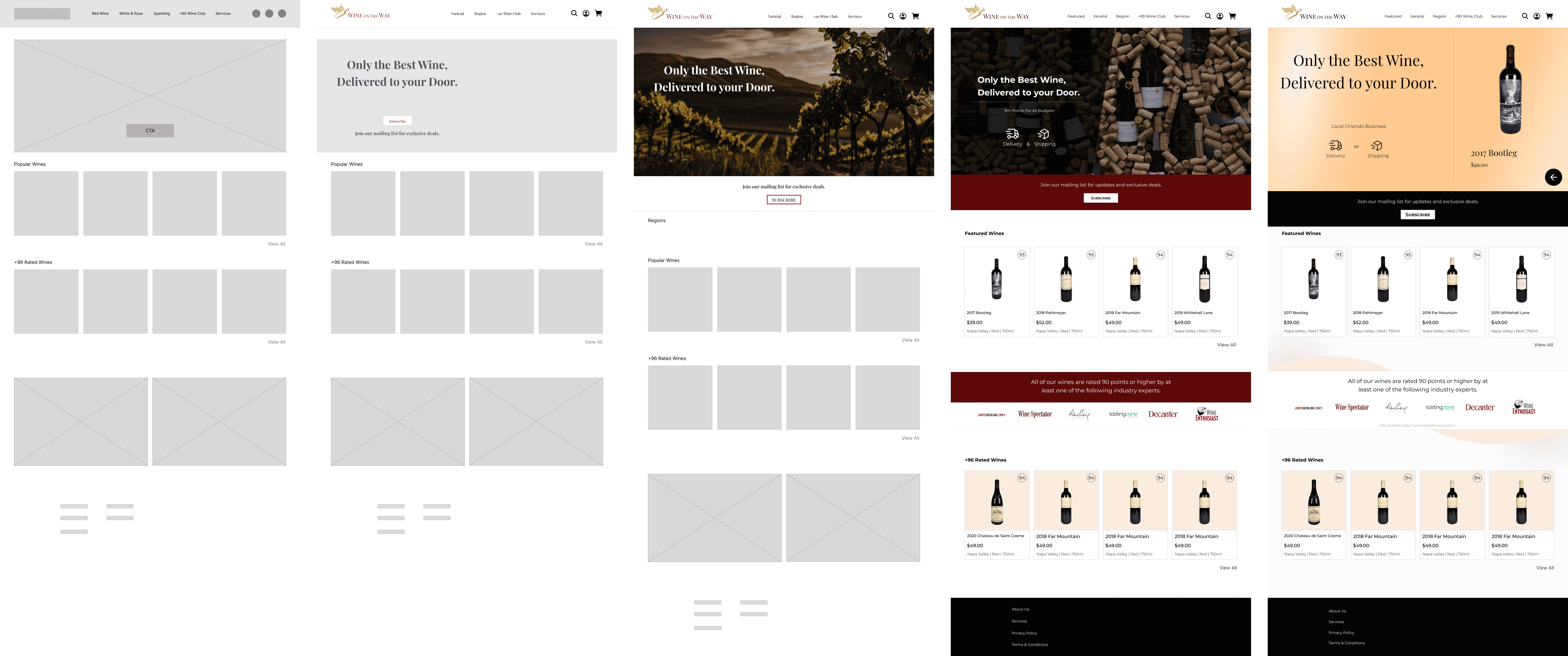
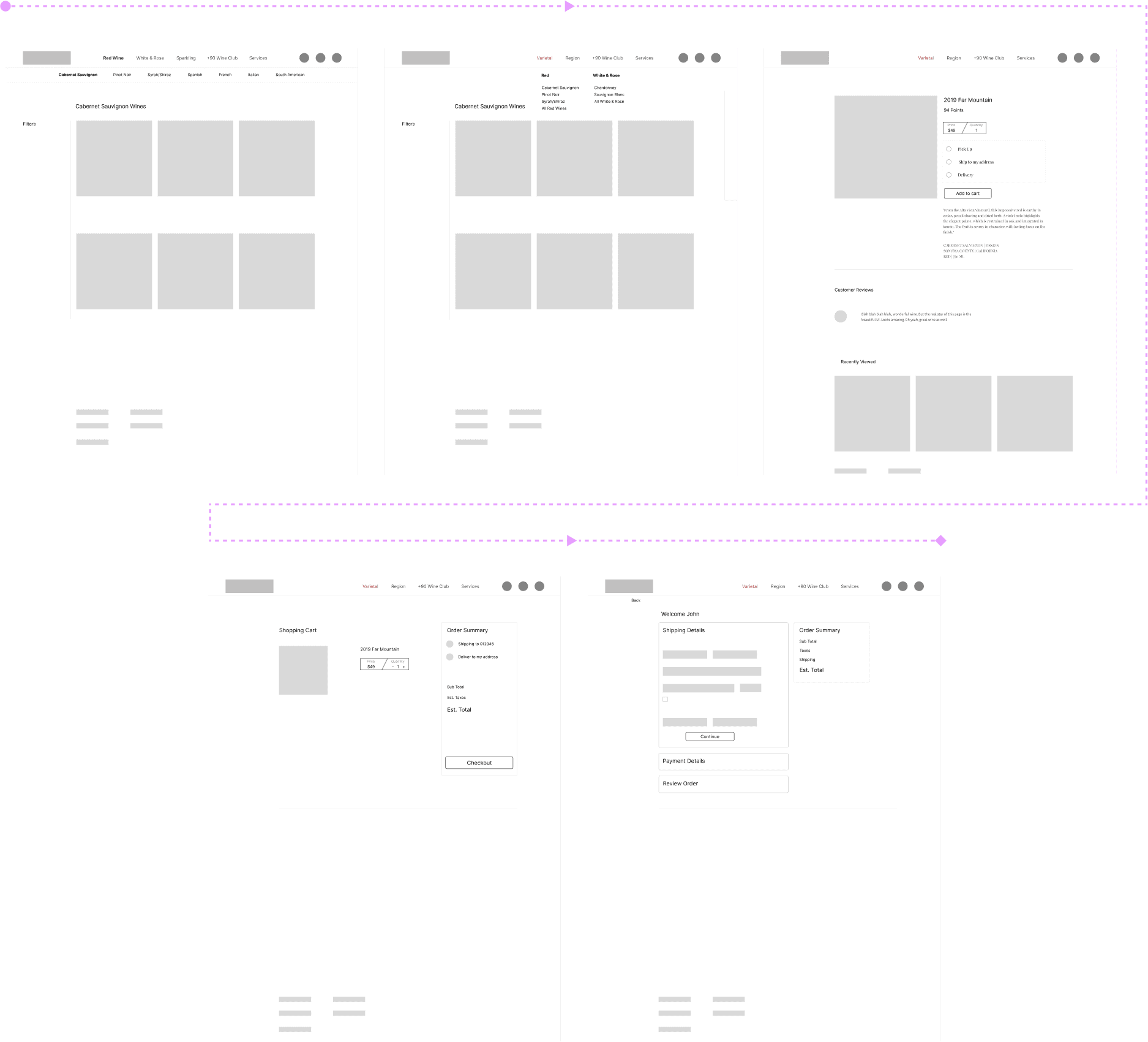
From experimenting landing pages, to optimizing the check out flow, the wireframes below help to understand which way the customer will journey to complete a purchase.
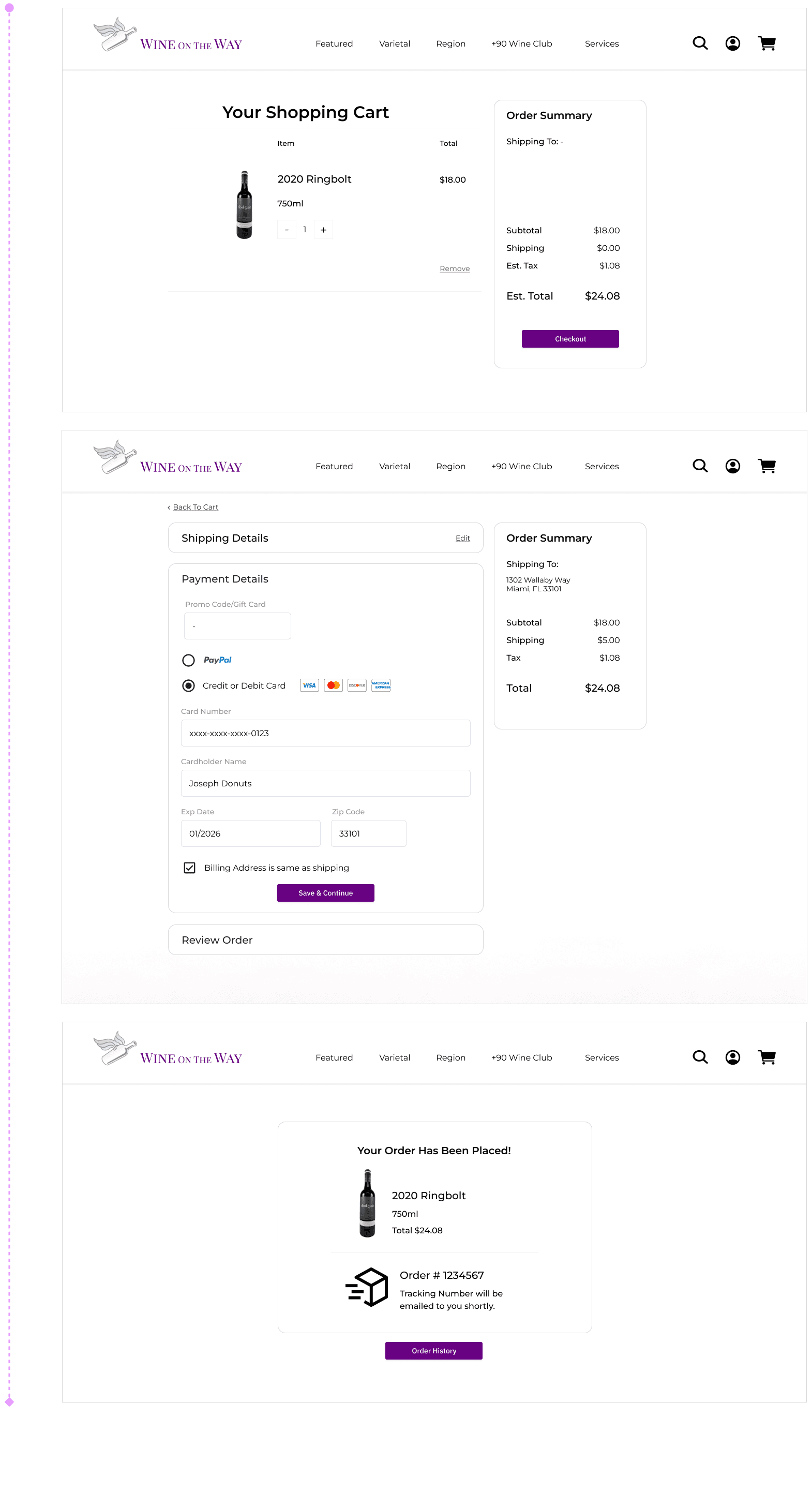
The highlight here is the idea of the last screen's check out, where your information, shipping, and payment details can all be consolidated into one screen with dropdown components.
Landing Page Usability Testing
Majority of participants (13/15) believed the landing page was well rounded, displayed all the information needed at first glance like featured wines, and was efficient in locating services and products.
Experimentation is good for the brain, but providing a simple and concise solution pays off. Easy to navigate, locate, understand, and take action for your wine needs.
Check Out Usability Testing
93% of participants (14/15) felt the check out was easy to digest, simple to navigate, and not overwhelming at all due to having every step on a single screen.
Feedback
Some initial feedback being taken in was related to being able to switch between shipping and delivery in check out, and to show saved items that can be easily re-ordered for signed in users.
- The local business still drives great sales through their original website, so what could be the reason for a refresher? While it seems strange to do so, the interviews and competitive analysis can explain otherwise on the fact that all customers want and deserve a better user experience that other locals provide and can easily distinguish from other commerce sites.
- How can we not overwhelm customers? Simple and clean navigation, product cards, checkout flows that don't need to be overcomplicated. Having a checkout flow all encompassed in one page can take away from a dragged out shopping experience.
