Apple Music Analytics
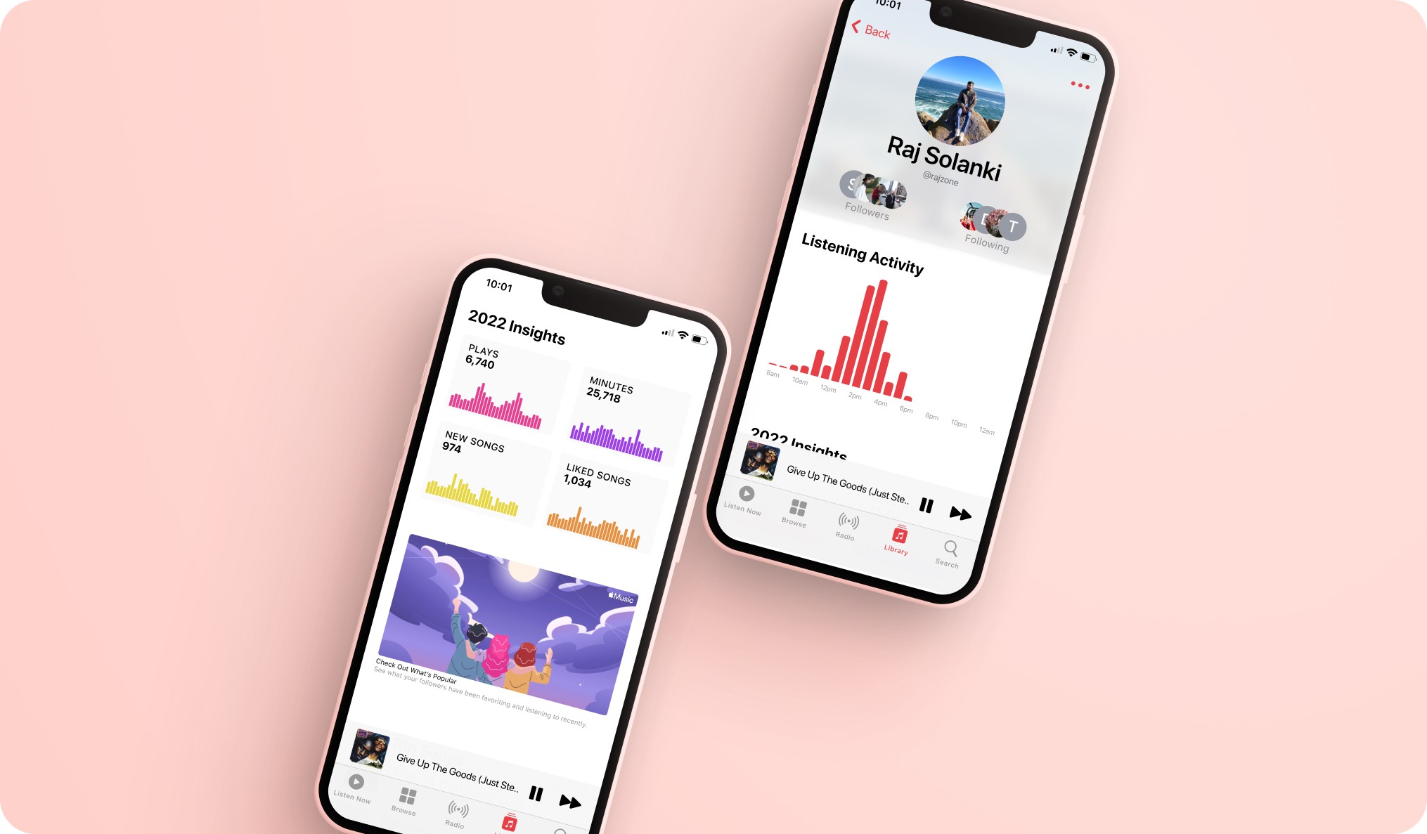
Driving higher user engagement through personalized profiles, data visualizations, and social discovery. Pushing past this normal end-of-year summary that has spanned across multiple industries with a detailed profile page, graphs, concise data, and new ways to discover music through friends.
Product Design - Feature Exploration - 1 Month
Let's think about Apple Music.
User Engagement
Apple Music doesn't show focus on trying to enhance the experience of music.
Social Growth
Services like Spotify take the stage with their social features like Wrapped and make things more personal for users.
No Personalization
Almost unusable profiles that do not share much but playlists, show a lack of personalization.
Spotify
Competitive Analysis
Yearly Historical Data
Top Artists/Songs
Social media presence
Limited insights
Last.fm
Competitive Analysis
Historical Data
Listening Habits
Music Charts
Easy to access
Interviews
Key Insights - 15 Participants
Data visualizations, favorite songs, & friend’s activity would be enjoyable and engaging features
Participants felt each of their preferred streaming platforms could have improved products
1/2 the participants would consider changing platforms if given more personalized features
Finding inspiration through Apple Music For Artists
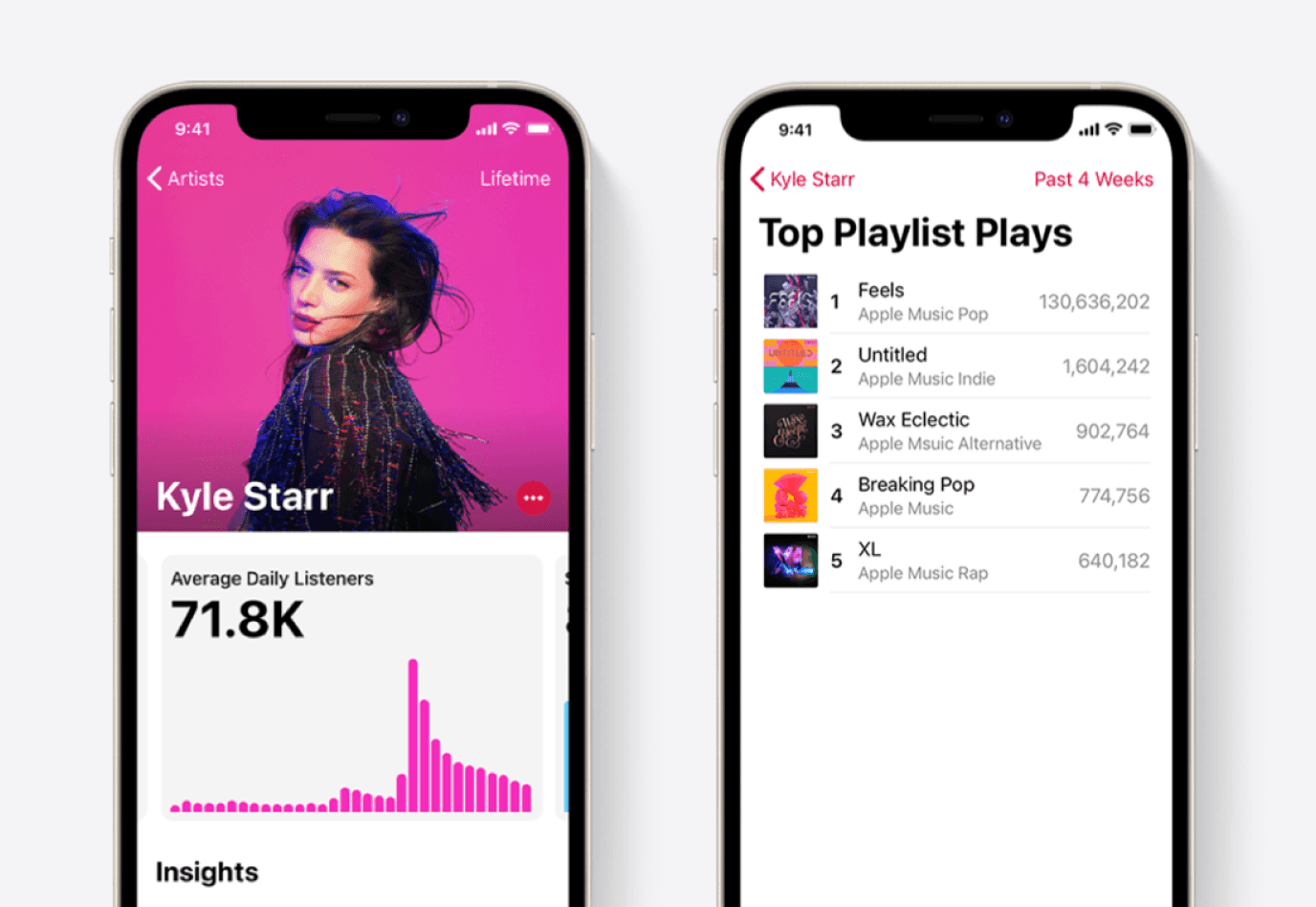
Apple Music feels complacent in it’s product over the years. Others like Spotify, stand out to make the most of an ever-changing culture where music meets the user.
Platforms should adapt and improve to remind the users they haven't forgotten about the experience they deserve which truly drives what people


Replicating Apple components
constructing easy-to-digest data
keeping Apple’s style intact
Apple's consistency and easy to use design is one of the most important reasons why their products resonate so well with users throughout time.
To build upon their work, we need to replicate and understand their style and systems well.
v1
v2
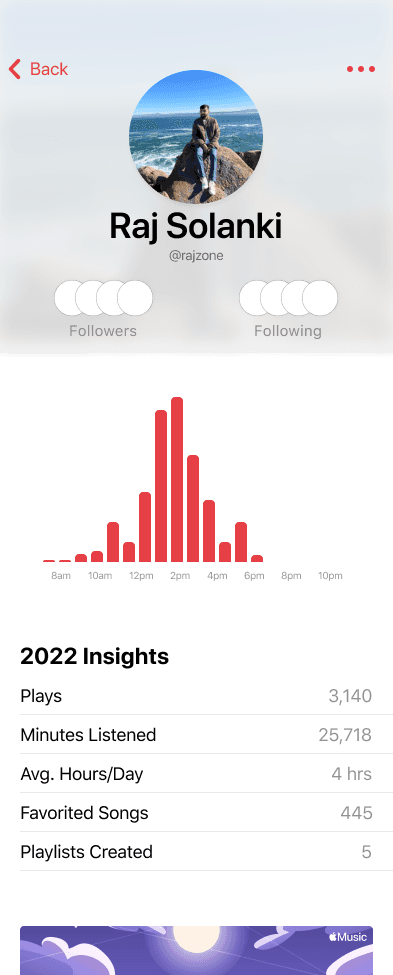
Listed Data Rows
or
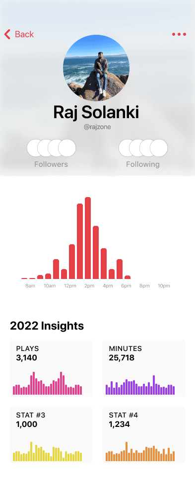
Visual Data Charts
80% of participants (12/15) had preferred the graph visualizations over the list. They felt the page would be more interactive and engaging with the visuals versus a more straight forward and traditional look.
With the inspiration of Apple Music for Artist, the graphs present a more engaging user experience whereas V1 has a strict laid out information section which feels like a missed opportunity.
v1
v2
v3

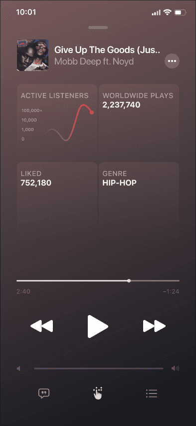
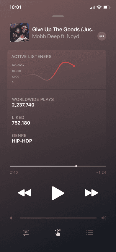
Focus on Visual Hiearchy
A few other versions were also made here but these were the top three that tested better overall.
V1 performed better than the rest with just ~46% of participants. This was honestly underwhelming to say the least as the other versions had a preferred rate of ~26% participants each. This feature definitely needs further exploration as how it would provoke better experiences for users.
Simply put though, V1 is a little more easily digestible than the other versions here which could be the reason for it outperforming the others. But with that, this screen is back under investigation to enhance the experience.
v1
v2

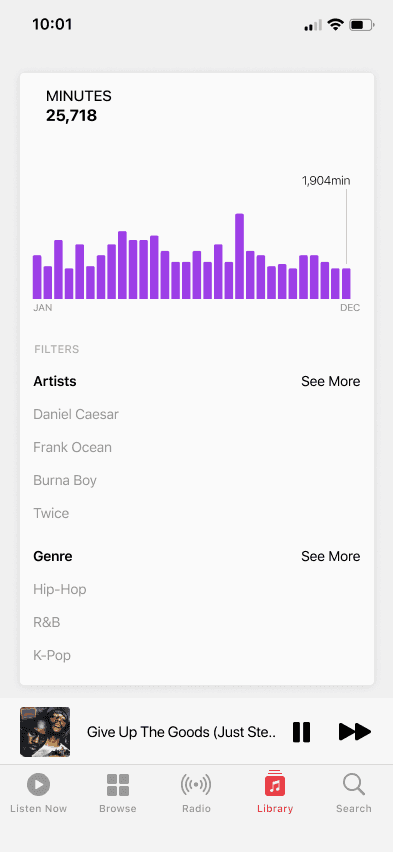
Adding Detail to the Data
In terms of graph visualizations, these versions are vastly different and performed miles apart (somewhat obviously). The idea to expand on the graphs was done under some time constraints but it dove into the experience more which definitely helps.
An aggressive 93% of participants liked the filtering options that made it feel more rounded. Another screen that will be explored in my free time.
Thinking Beyond "Wrapped"
Why does the data matter?
Data is just one point of contact that can drive more engagement and social connection between users. Exploration of music, social tendencies, stimulating growth for the platform and artists can all be seen as positives.
Why is this feature important?
For the music lovers or curious minds, this goes beyond the usual Spotify yearly “Wrapped” feature that just emphasizes FOMO. We want to give a personal hub that highlights your habits and allows you to dive deeper.
Is this feature complete?
Not by a long shot because of all the different approaches that can be taken. Can we represent data better? What about users who don’t frequently listen? What other areas can be engaging? Iteration continues.