Grove
Scope
Brand Identity
Illustration
Web Design
Art Direction
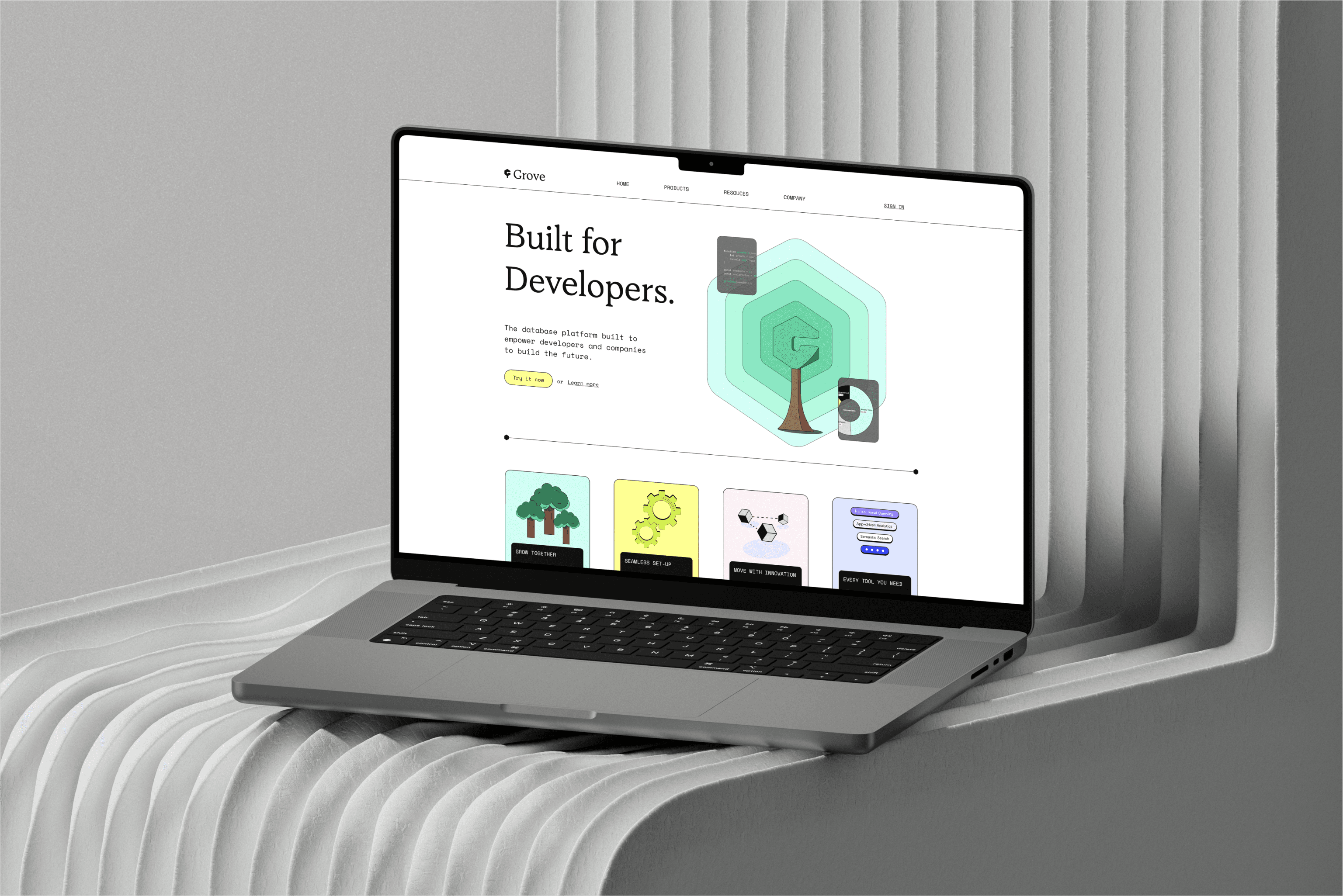
Grove is a developer-first database platform designed to effortlessly scale and manage data. This case study explores the brand's unique visual identity, with a focus on simplicity, scalability, and the fusion of technology and nature.
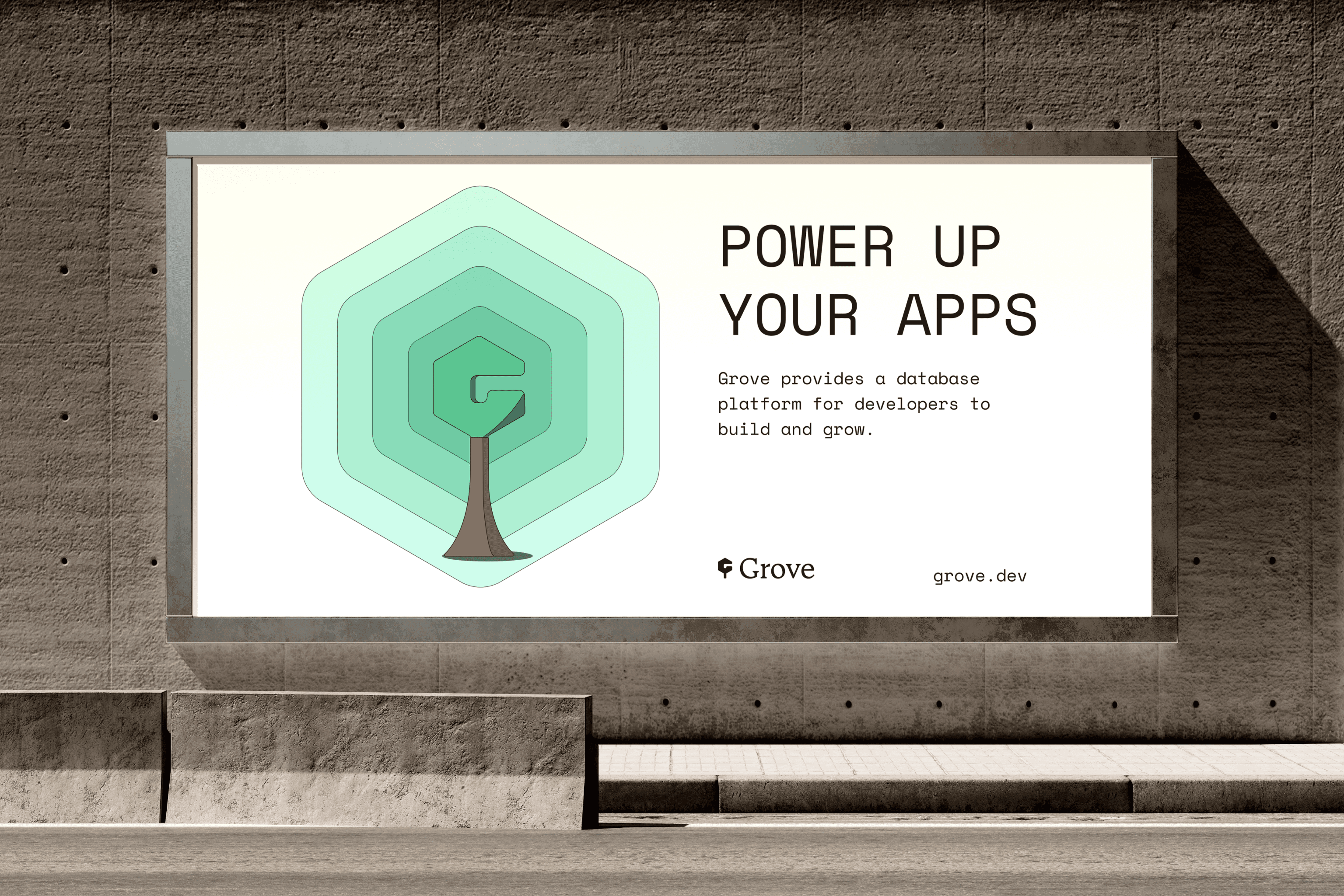
Through thoughtful design elements like minimalistic logos, vibrant color schemes, & clever illustrations, Grove's mission comes alive to nurture data growth and streamline the developer experience.

Initial Explorations
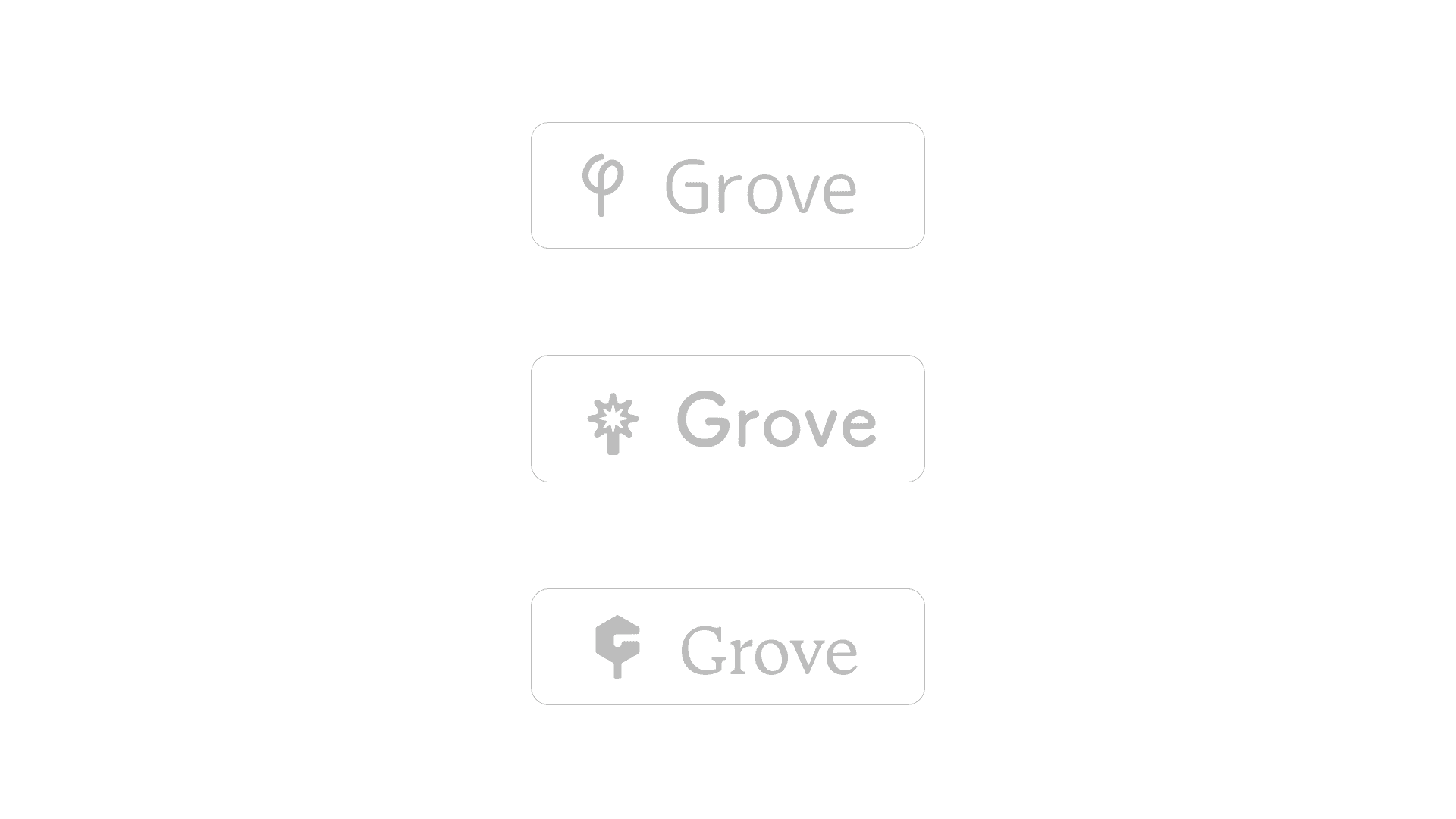
Initial iterations were meant to find some sort of connection between a theme of nature and technology. This part is enjoyable for me as we get to explore different kinds of fun concepts, interesting logo inspiration, or just flat out going crazy with some sort of unforeseeable logo/starting point.
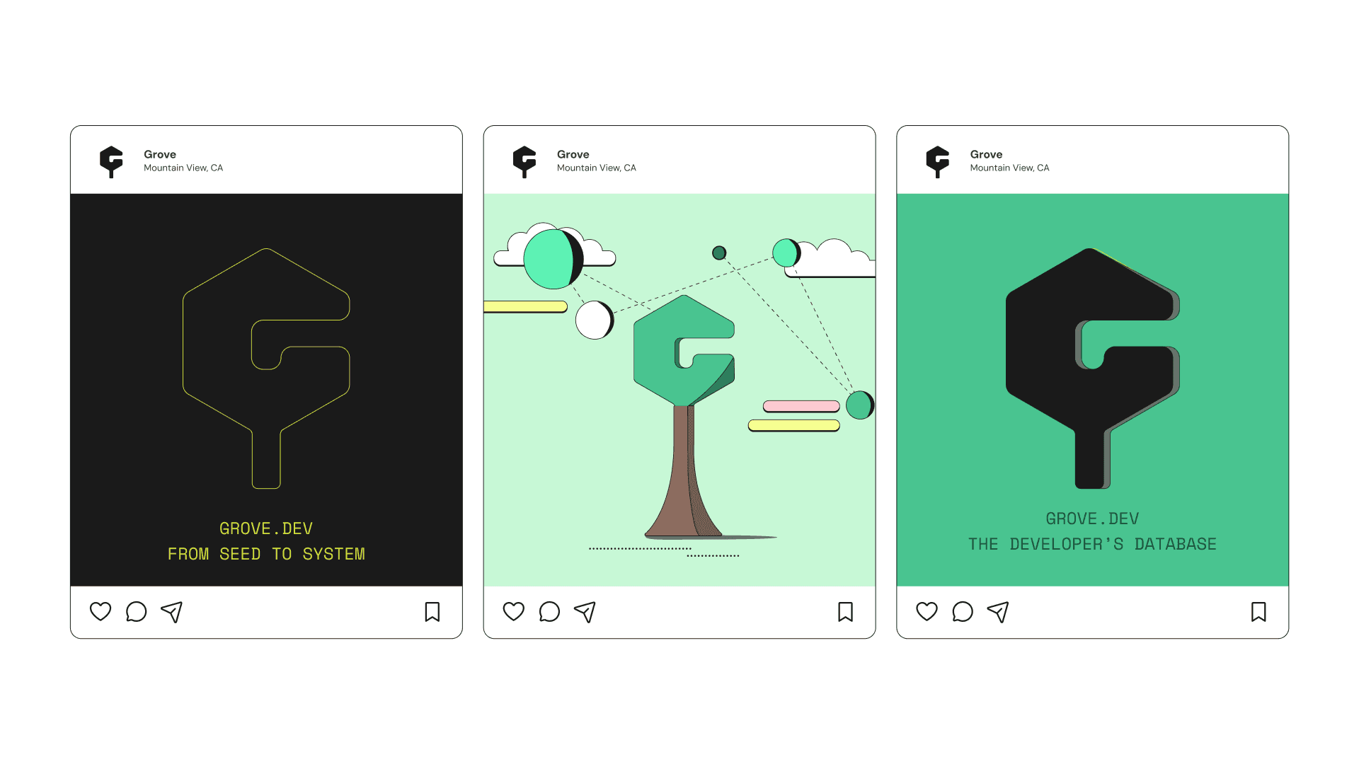
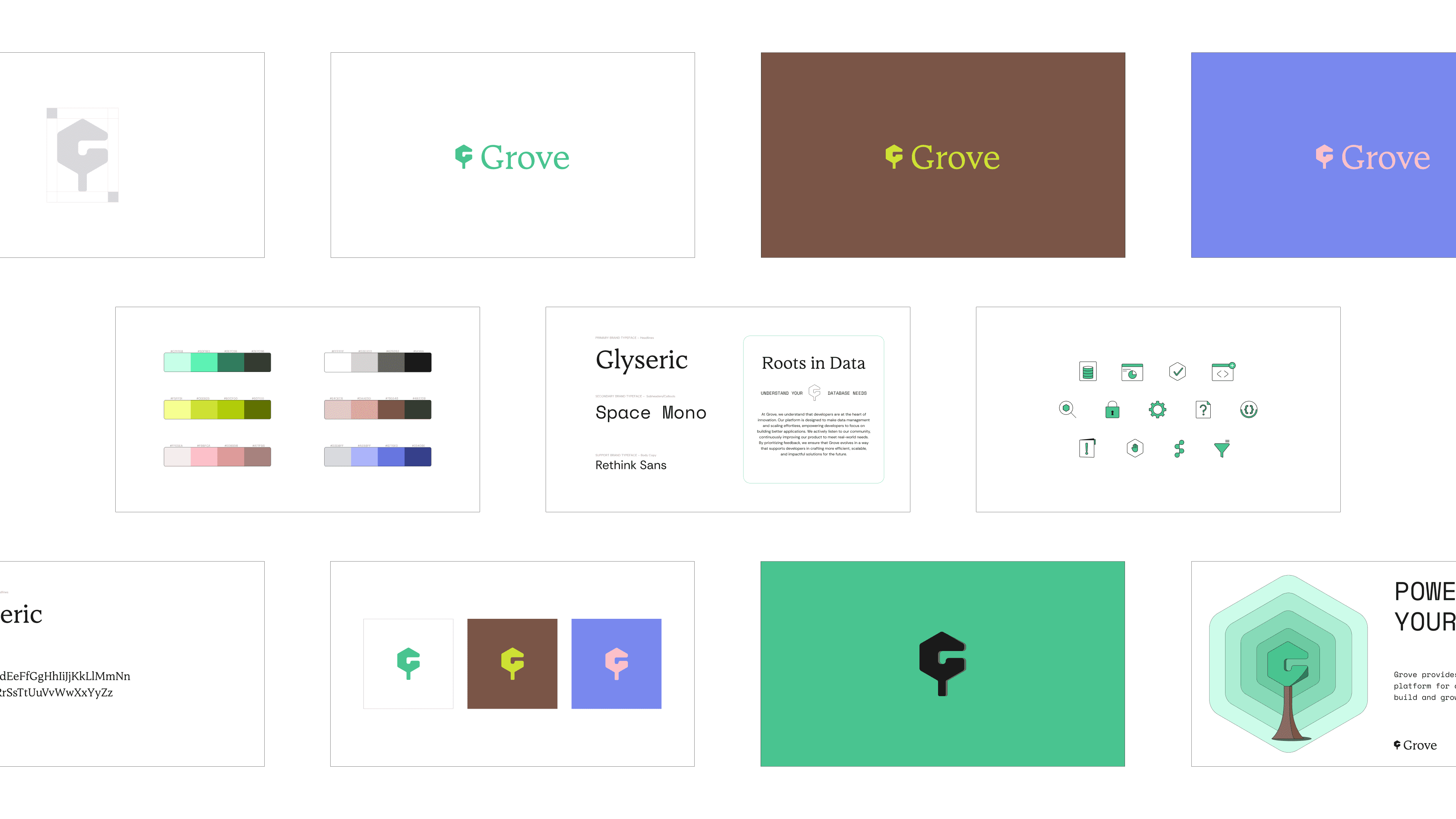
As I was doodling or just exploring font pairings I came across a couple different ideas of branching out, or using a tree as an idea. The final logo was chosen due to the way it pieced together a concept of a tree and felt arguably close to a "G" at the same time. Grove, trees, nature, all that jazz.
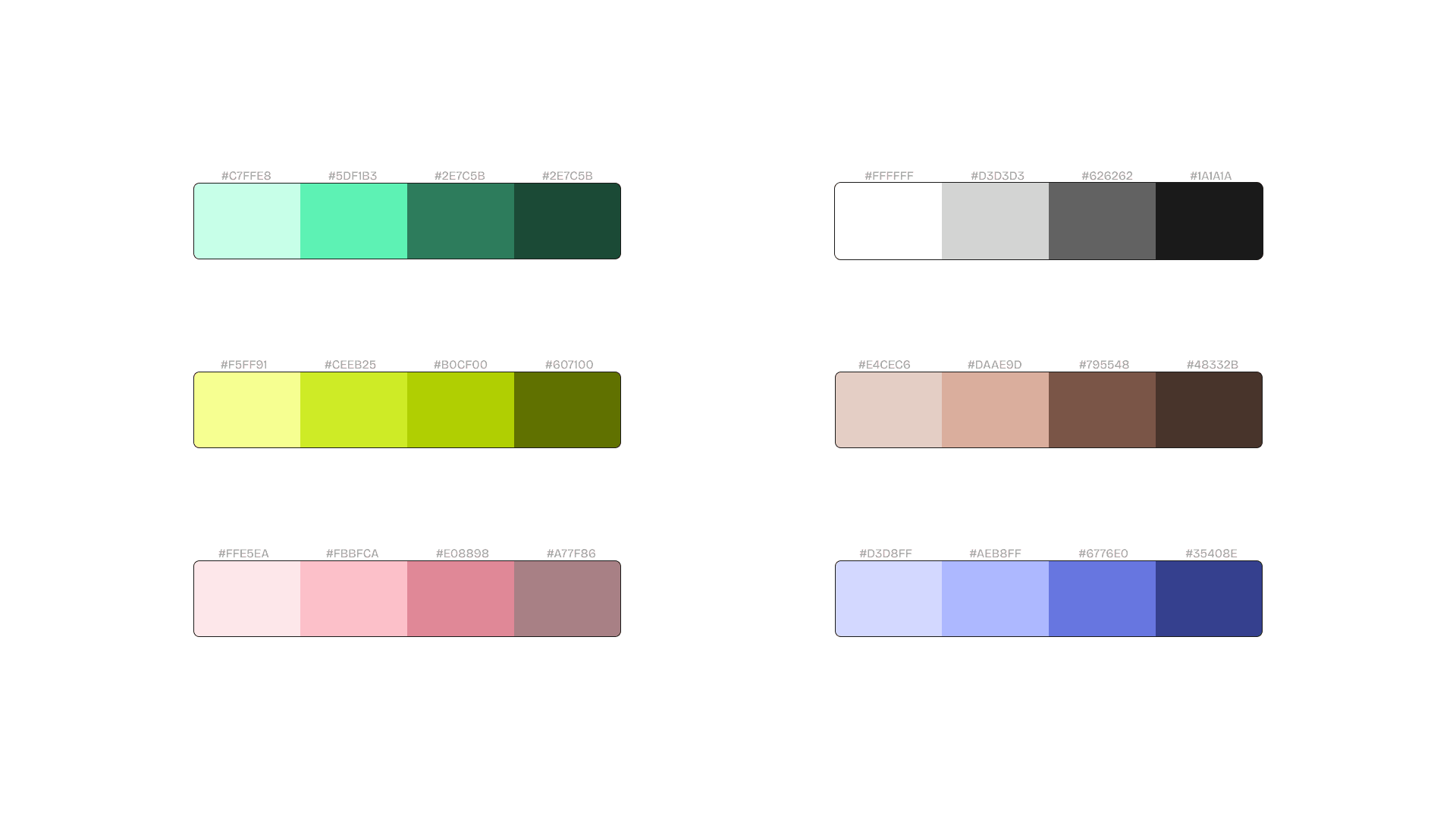
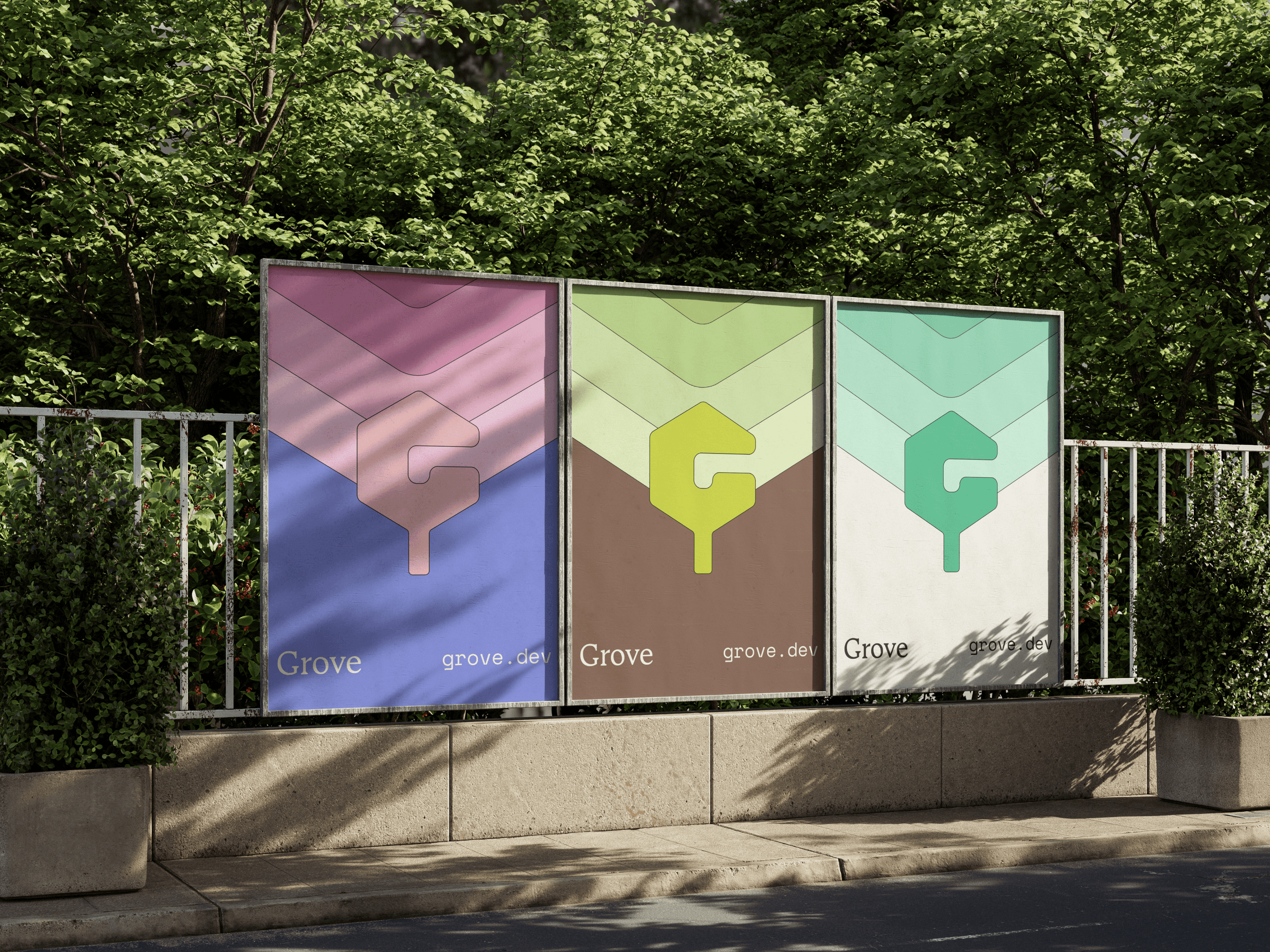
Colors are always a fun time but can feel like they take forever. Of course as this was tying together nature and technology, I quickly felt drawn to just using some forest-y colors, but still trying to tie in some funky tech colors to be used when possible without too much complexity. I think if people were just noticing a palette of normal greens and browns it would get a bit boring, so throwing in some brighter colors to mix things up was the right call when we dive into graphics, marketing materials, and expanding on the identity.
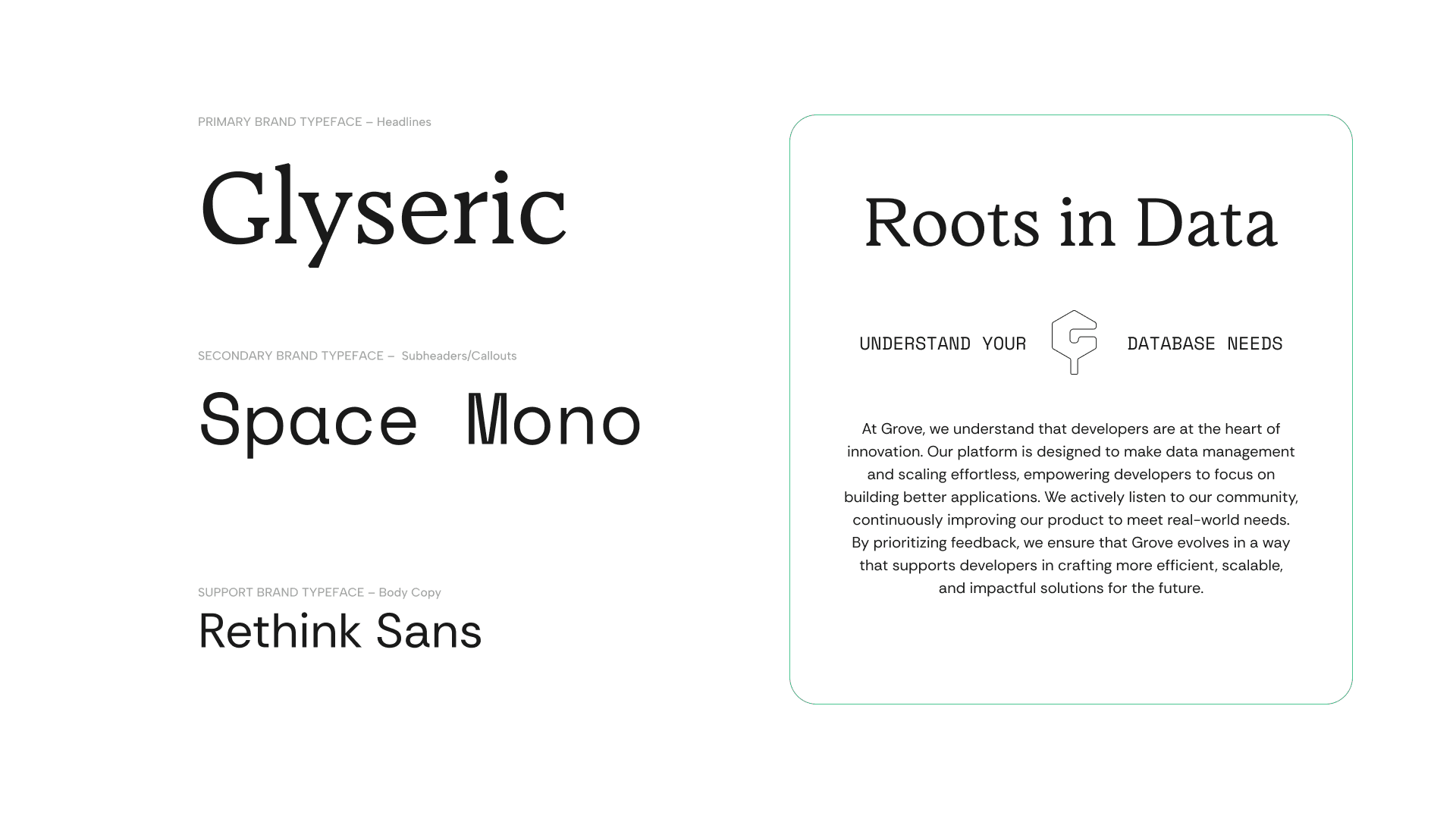
A serif font was going to be important as a primary and included as part of the workmark because it traditionally feels more reliable, and practical as a font. Still has a traditional but clean look to it that feels trustworthy. A monospace font was chosen as a secondary simply because it ties back to the nature of coding and programming for developers, which works very well as subheadings and callouts. Finally a sans font for easy legibility and a clean look in all body copy.
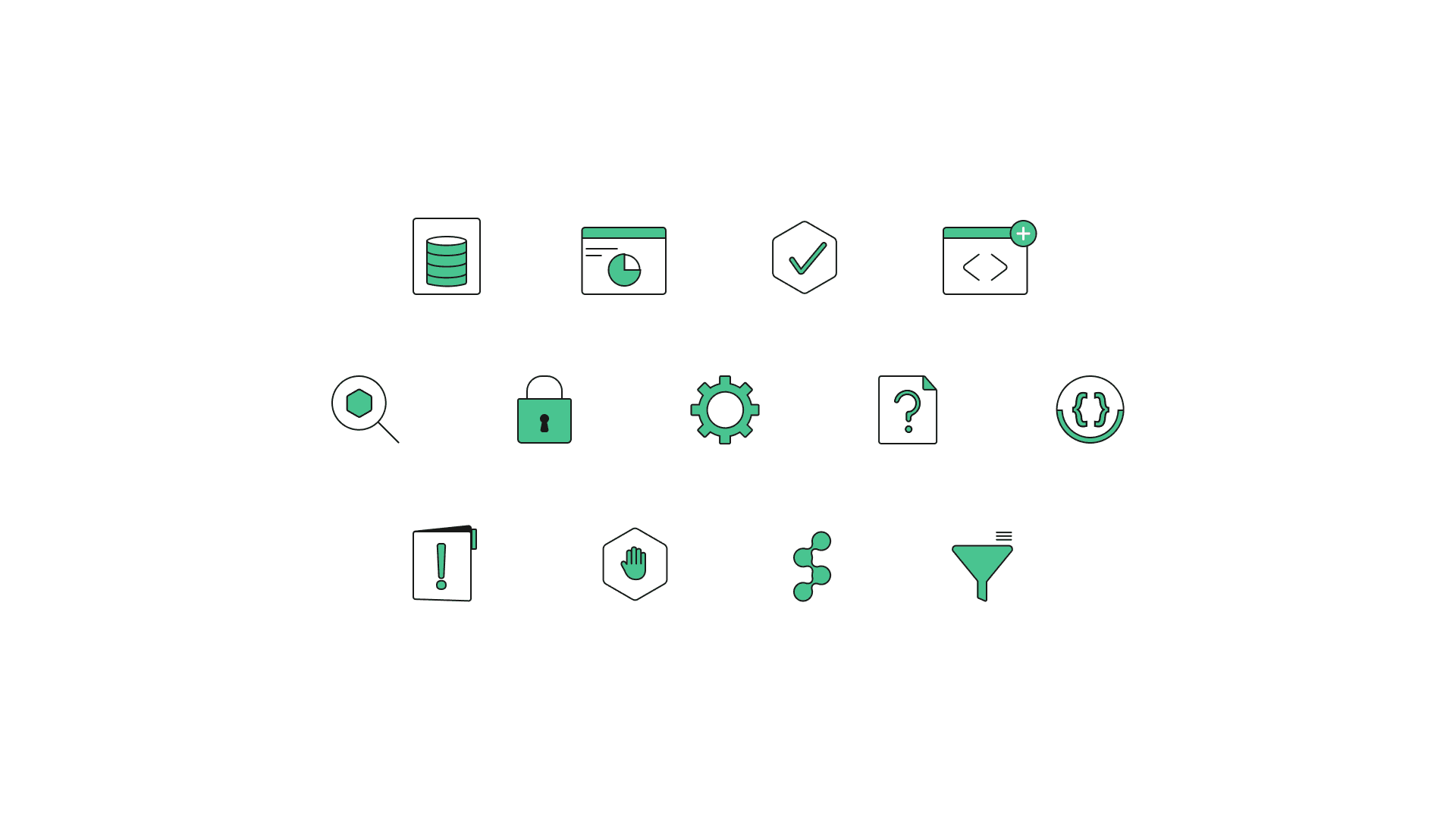
Icon library put together as well - these icons were meant to illustrate multiple concepts that live through the developer database lifecycle and realm. From things like querying, hosting, APIs, errors, structures– known to developers and engineers once they see certain iconography that can better understand certain products or functions available within Grove.
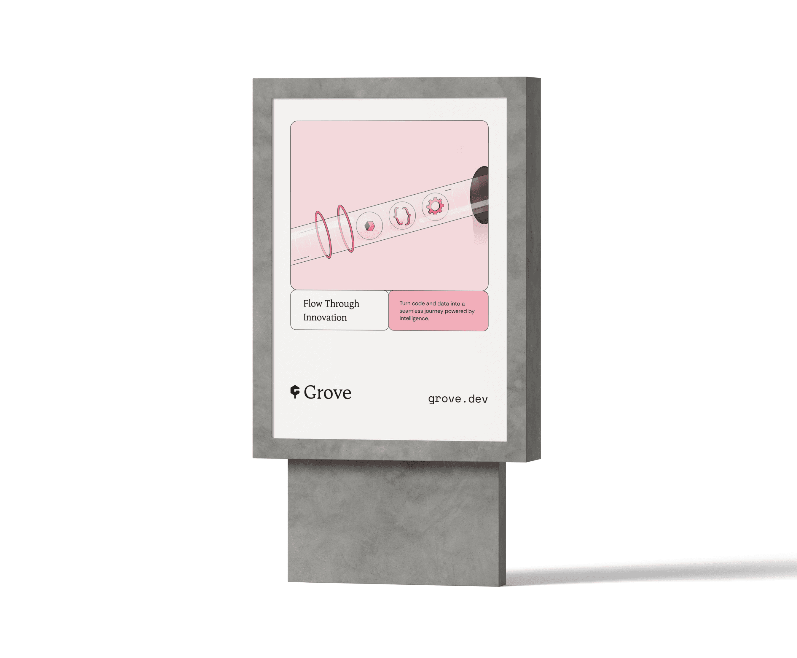
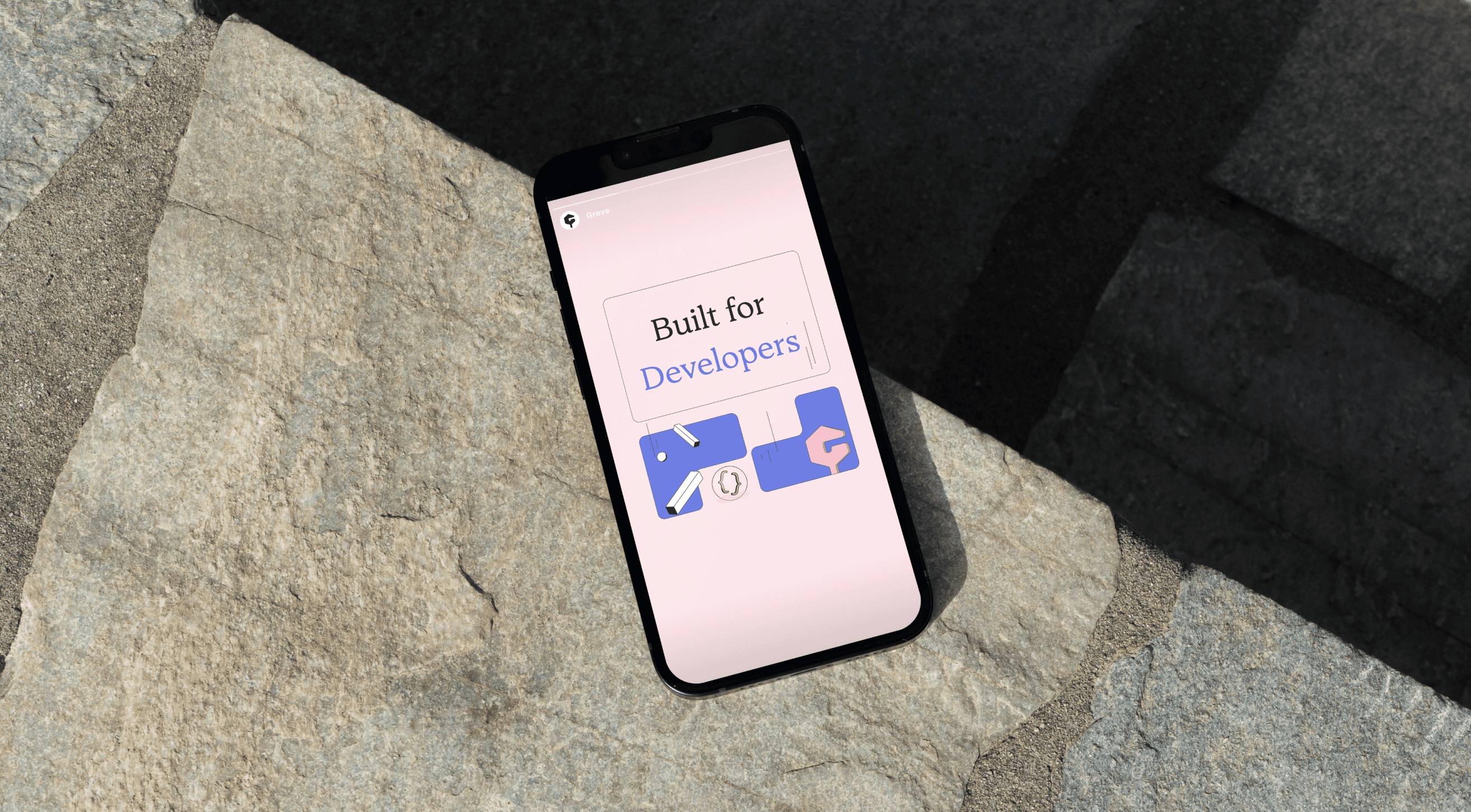
Series of illustrations made to simplify solutions and explanations with a small hint of playfulness. It's not often that I do illustrations, nor am I an expert but I do believe practice makes for progress. The illustrations were meant to be simple and not overly detailed or extreme due to the nature of the developer industry. Developers generally don't like to over-complicate things and so the overall identity shouldn't feel that way either.
